Cold as Ice.
Graphics & videos designed by Darius Snow
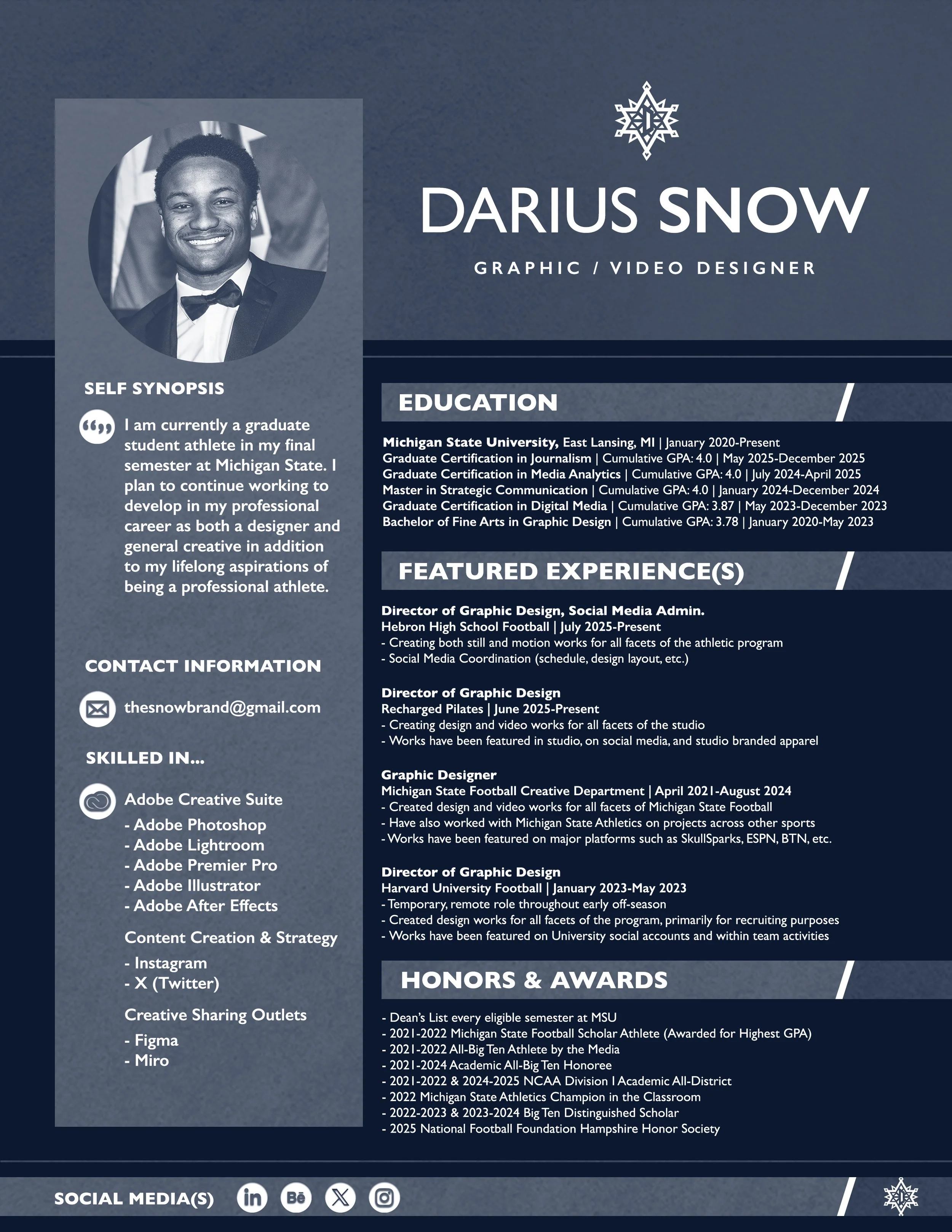
Creativity harnessed over 20 years of life — capturing moments for what they are and designing them as what they can become; all culminating in what has always been “Cold as Ice” by the touch.
A crayon and a dream…
is all this design thing started with. Back when I was in pre-school actually, my assistant teacher would have different kinds of football players (uncolored) on sheets of paper for me. Back then, who knows why either, I would only use crayons to write or color anything. Albeit, whenever I do look back on that rather simple gesture, it’s hard for me to not think of that year, my last year living in Ohio, as the foundation of what has become a very creative life for me. When I was a kid, especially when I was that young, I would always have the same kind of dreams. Those dreams were always one of two things; sports or art. Most of the time the two were intertwined in some way, but just about every night I would fall asleep and every morning I would wake up with at least one of the two on my mind. As I grew up over the years the dreams never changed, but the crayon did. The end of middle school and beginning of high school was my introduction to graphic design and all the many creative outlets digitally. Artistically, my work evolved as I learned how to work amidst the Adobe Creative Suite, but I didn’t abandon the old-fashioned style of art either. What started with a crayon began to evolve into stencils and more professional channels for sketching and drawing, but I still continued to draw nonetheless. I created, and still create with the mindset of disrupting the norm, but always made sure I had the ability to stay within guidelines if I had to. Little did I know that flexibility would be profoundly helpful as I got older. At the end of the day, my goal is and always has been to be different — unlike the rest of the world in whatever I do. I’ve found that you can take inspiration from just about everything you see, and in return inspire everyone you see. That realization has led to countless designs that can look similar, but will always have their own distinct features within. If you look at my work or read something I wrote and think “that’s not right,” then I have succeed. To be different is to be unique, and in being unique is the opportunity to be legendary (Click the Résumé for the Downloadable PDF).
The Mission
The mission of Snow Stylez as a graphic and video design LLC is and will always be to create with the mindset that the work being designed is for myself. The time taken, attention to detail, and focus attributed to creating the best design possible. Works vary depending on the task, but given freedom, an abstract outlook will always be taken. As aforementioned, the goal in most to all works is to be different than all that’s around it.
ENLIST THE STYLEZ
ENLIST THE STYLEZ
Graphics, logos, videos, you name it.
Contact via Email
thesnowbrand@gmail.com
Hours
Monday–Friday
11am–7pm
Year of the Storm
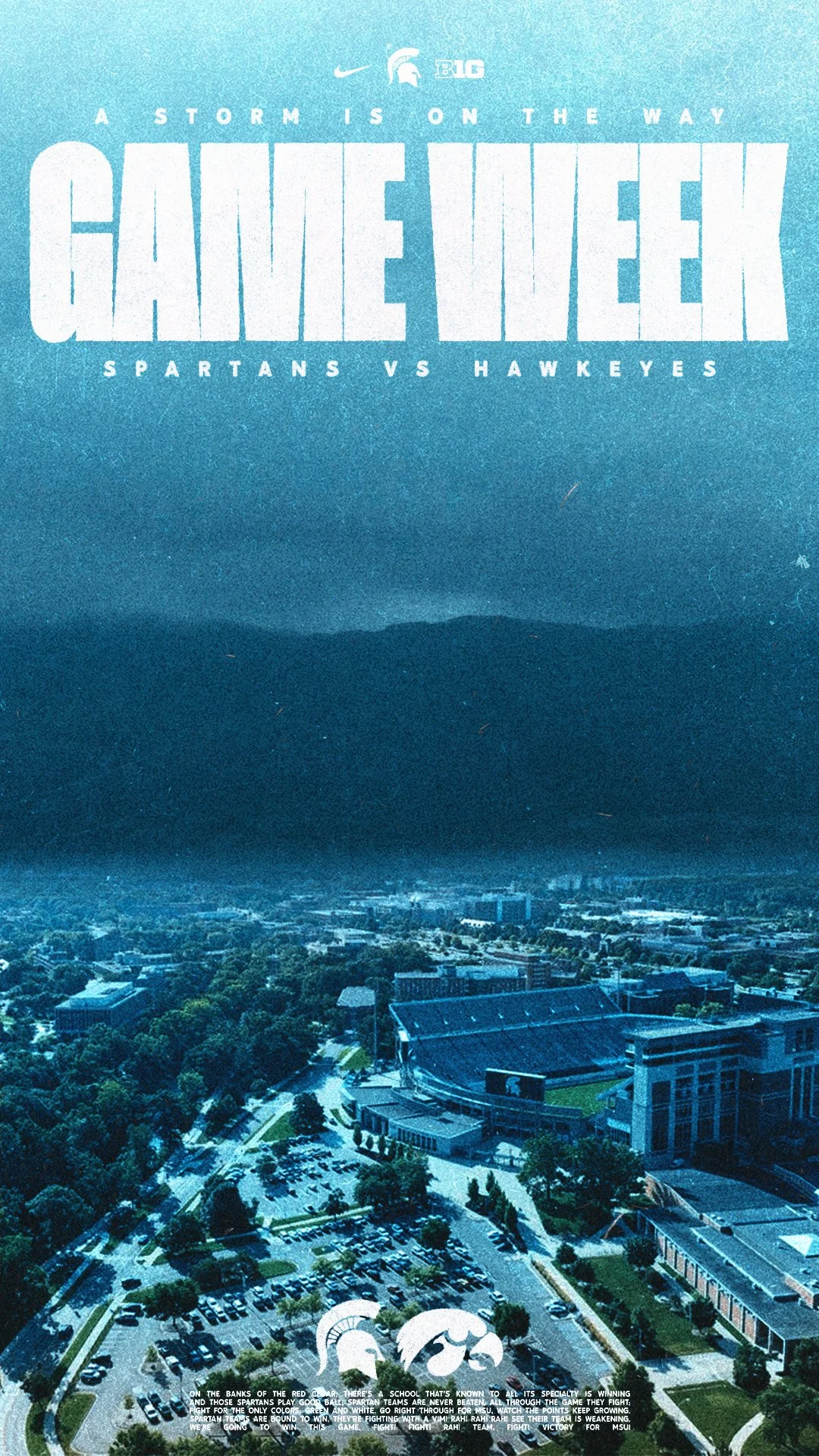
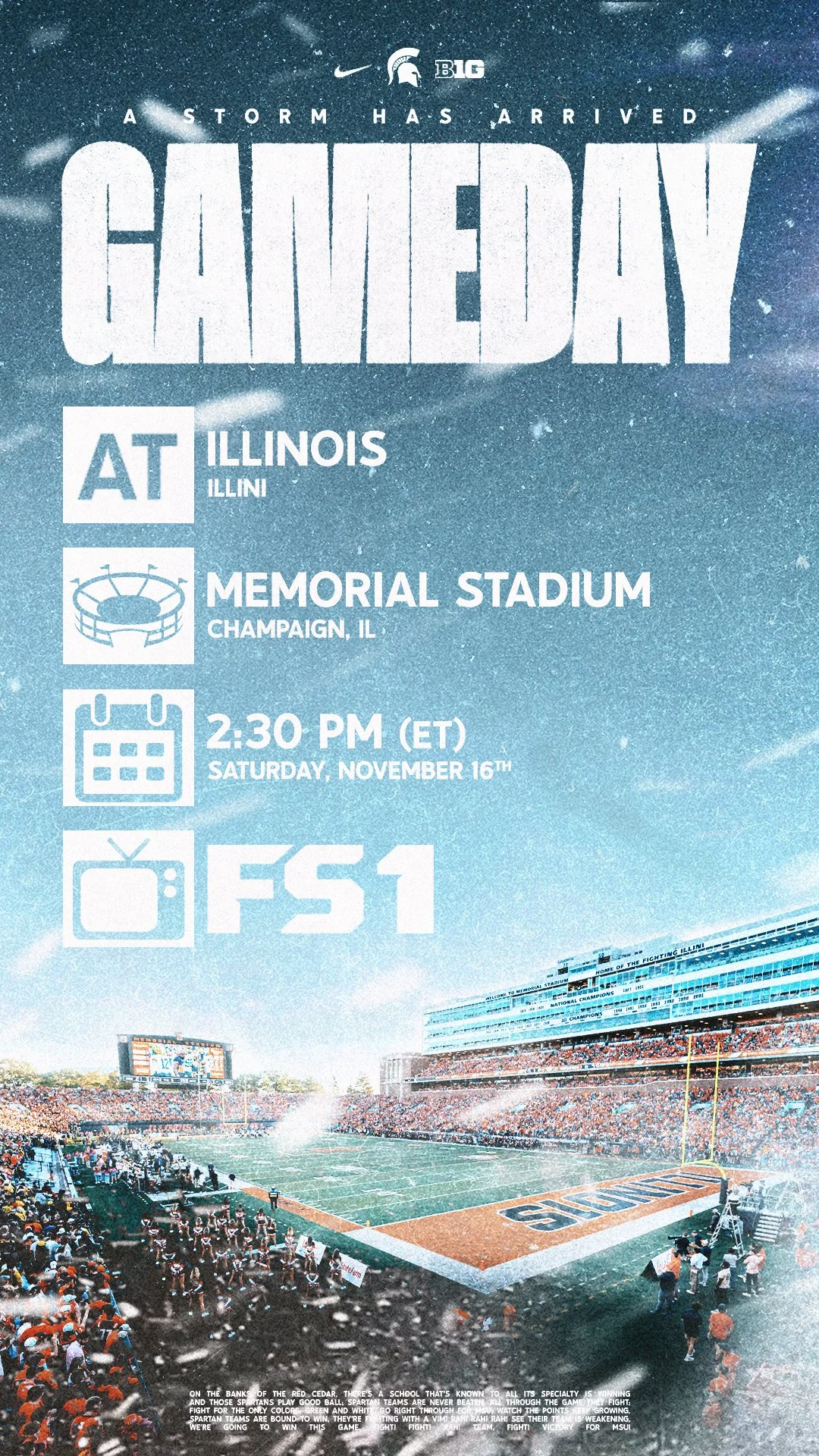
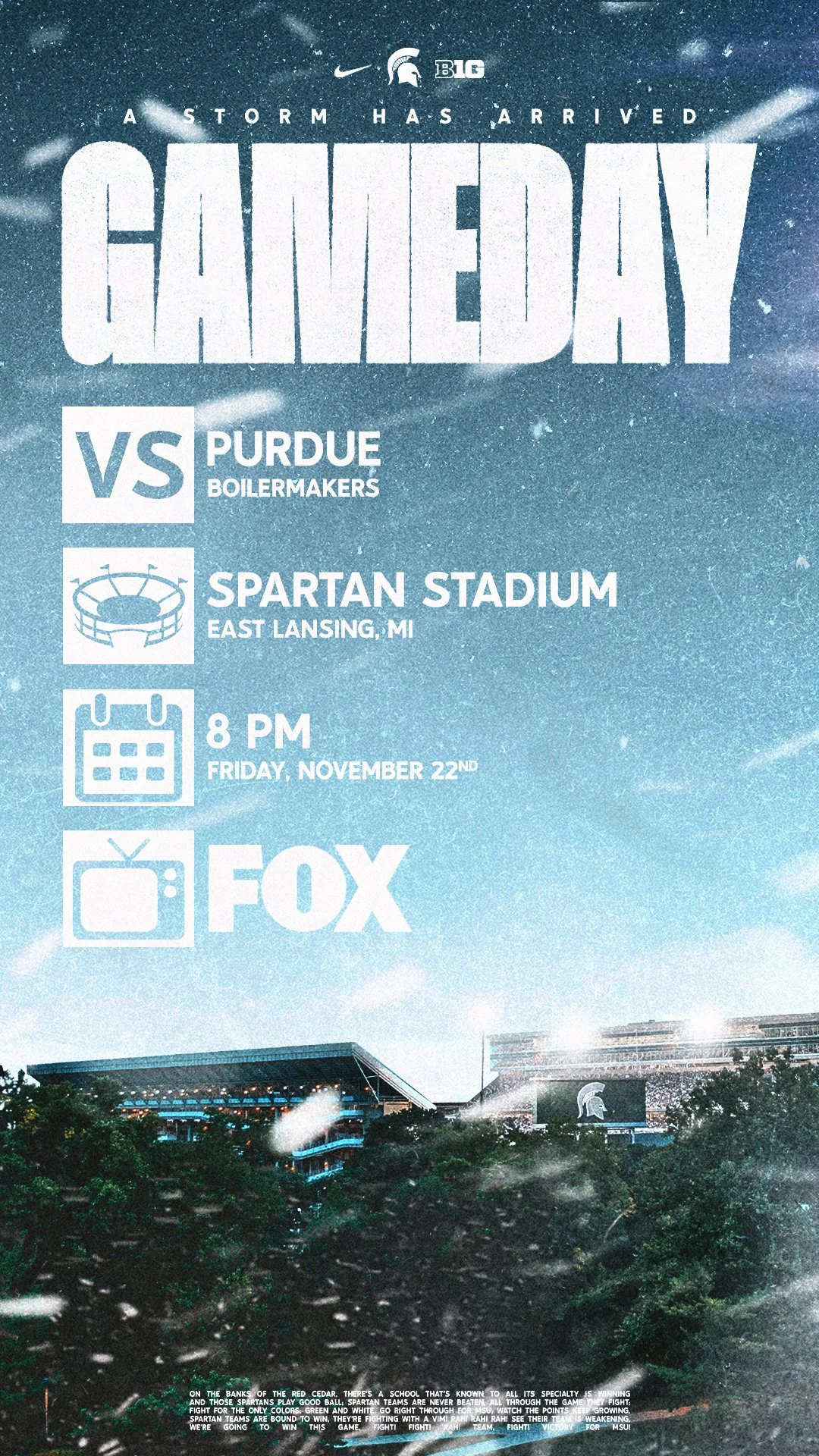
Separated into three different weekly posts: a Game Week, Wallpaper Wednesday, and Gameday post specific to each game over the course of the season. Channeling my last name as a focal point, each Game Week and Gameday post features a cold, snow-like element in some form which alludes to my nickname as a player, the “Snowstorm” also. As for the Wallpaper Wednesdays, unlike the Game Week and Gameday posts they were mostly not game specific in design other than the game number at the bottom, but were each created with a unique inspiration behind them. This was a process that spanned over months, but was extremely exciting to complete! Take a look into part of the sporadic route of the “Storm” throughout the entirety of the 2024 Michigan State Football campaign:
Client
Personal
Year
August 23 - November 30, 2024
Contemporary Movie Poster Series
Client
Michigan State Athletics
Year
December 21, 2022 - October 7, 2022
Manipulating the Now
When it comes to advertising a product, or in this case people, I’ve grown to firmly believe that it all comes down to capturing the attention of a target audience. With that knowledge, I came up with idea (about a week before I played in the peach bowl) of recreating what captured the attention of most people around my age; the coveted “Spider-Man: No Way Home Poster.” Around a few hours later after I finished it, I showed just about everyone at home (I was with my family at the time). They all said that they loved it, but I knew if I wanted to get a non-biased opinion I would have to post it somewhere public; which all led to jumping on my favorite social media platform, Twitter. Ten minutes later, if that, the post had already blown up. I knew that I had done what I do most of the time, something that my family would call “messed around and did something.” This simple, fun idea of recreating some world-class designers and illustrators work was something that I dreamed of doing, but never did. After that experience with the Spider-Man No Way Home poster I felt that there was no way that I could stop there. As movies and tv shows that I watched continuously came out, I continued to create, or in this case recreate. The best part about this series is that I don’t think it’ll ever end. Yes, as I get older may the subject of the recreations evolve from Michigan State, most likely so to be honest. However, the fun that I have recreating it and joy that I feel after seeing the end product just simply can’t be beat. I look forward to what is to come with this series, my favorite overall.
Harvard Football
Over the first quarter of 2023, I was granted the opportunity to serve as Harvard football’s lone graphic designer on staff; tasked with creating graphics and elements for team use as well as recruiting purposes. The works created during my tenure with the program were represented throughout the team’s facilities, and social medias when needed. Working once again primarily out of Photoshop and Illustrator, an exciting and memorable part of this experience was creating and replicating elements to use throughout the opportunity. You can see how those elements and designs came to life below:
Client
Harvard Football
Year
January 6 - May 24, 2023

MSU Football Logo Design
A few favorites created for Michigan State Football. The first, a 2014 Rose Bowl Reunion logo for the 10 year anniversary of the decorated 2014 Michigan State Football Rose Bowl Champions. The second and third are the favorites of a four-year series of logo designs for the annual Michigan State Football Spartan Dawg Con, where former and future athletes visit campus in late July. All three designs feature university-specific elements that are highlighted in the descriptions below:
Client
Michigan State Football
Year
April 2021 - August 2025
Talkin’ Stylez.
-
Derek Blalock | Houston Rockets Art Director
Darius Snow exhibits passion and an exceptional work ethic in whatever he pursues, and to me, that’s more important than his immense talents as a student athlete, a content creator, or as an entrepreneur. Getting to work with Darius at Michigan State was a joy as a director because of his rare combination of that exceptionally high work ethic and a reliability to produce the quality of content on tight deadlines that is expected at the Division One and Professional level.
-
Jackson McSherry | Harvard Football Director of Football Operations - NFL Liaison
Darius’ designs contributed to the recruiting efforts at Harvard Football with expert graphics and creativity. This is professional quality work that impresses potential student athletes and effectively markets our program!
-
Jake Reiling | Ole Miss Football Assistant Coach
Darius is incredibly talented in having a great feel for the moment and creating a graphic to match it. He’s always timely, detailed and everything he makes is guaranteed to be one of a kind!


